Color Theme Sass Mixin Part 1

We have a website design with sections that we want to style differently based on color themes. Styling these themes in the CSS can be tedious and frustrating, especially when we need to override default styles like text color. Instead of bloating our CSS with micro-differences and constant manual repetition, we'll explore the idea of a color theming mixin.
Defining Color Themes
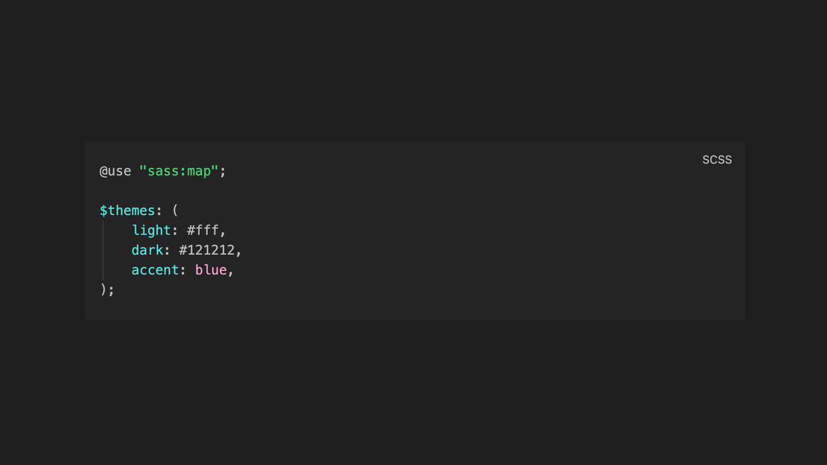
First, let's define our color themes using Sass variables. We'll create a variable declaration block with themes like "light," "dark," and "accent." These themes can be specific to your brand or design system. We're also going to use the mapping ability from Sass, so we'll put that at the top of our file:
@use "sass:map";

$themes: (
    light: #fff,
    dark: #121212,
    accent: blue,
);
Implementing the Color Theme Mixin
Now, we'll define a mixin called "section-color-theme" that allows us to apply our themes to sections. By default, we'll have the mixin use the "light" theme. However, we can easily change this by passing in the theme name we want throughout our SCSS (example at the end). In order to handle all the different theme options, we'll set up some "if" conditional statements to make the right color combos for the right theme.
...

@mixin section-color-theme($theme: light) {
    @if $theme == light {
        color: map.get($themes, dark);
        background-color: map.get($themes, $theme);
    }
    @if $theme == dark {
        color: map.get($themes, light);
        background-color: map.get($themes, $theme);
    }
    @if $theme == accent {
        color: map.get($themes, light);
        background-color: map.get($themes, accent);
        h1, h2 {
            color: orange;
        }
    }
}
Since we're using Sass maps to store our color themes, this whole system is now flexible and maintainable. Sass maps allow us to grab theme values dynamically based on the theme name.
The map.get function is the magic—we pass in the name of the theme (captured as $theme), and then we use map.get($themes, $theme) to look for that theme in the list of $themes we defined at the start. So if we use the "accent" as the theme, our get function would look like this: map.get($themes, accent) and return "blue."
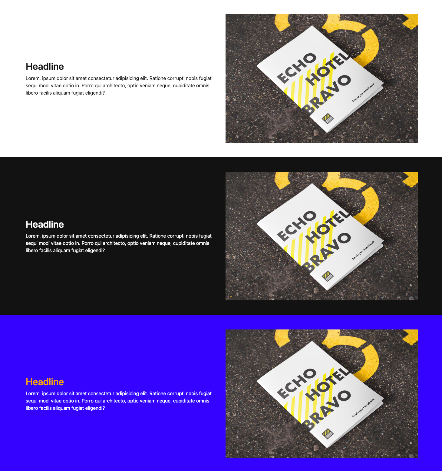
Applying Color Themes
To apply the color theme to a section, we'll use @include with the name of the theme we want to use. Now we have classes that we can put on our sections to get alternating color themes on our website effortlessly.
.light {
    @include section-color-theme(light);
}
.dark {
    @include section-color-theme(dark);
}
.accent {
    @include section-color-theme(accent);
}
Enhancing the Color Theme Mixin
While this basic setup works well for simple background + text color variations, it may become more complex when dealing with multiple color properties like background, text, and headline colors—and especially when making sure the color combinations are accessible and paired correctly together.
We can expand the mixin to handle multiple color values almost like JSON or a python dictionary. Head over to Part 2 to create a color theming mixin for more robust design systems.