What They Don't Tell You About <h...> Tags
It's a HUGE mistake to choose an H3 just because it has the correct style. Using tags to style the page may be hurting your accessibility and SEO all at once. Here's how to fix.


You’ve been lied to. You were told you you can use <h> tags and <p> tags in your HTML to add text to your webpage—and that the <h> tags make text bigger.
Now when your designers want to put text that looks just like your <h4> above your <h2> headlines, so you reach for an <h4> because it’s already styled the way you need it...and...Done!
Wrong. It’s lies—it’s all lies!!
Here’s what’s wrong and how you fix it.
Designers and SEO managers will have opinions on this, but there something more important than any of that: accessibility. I promise that when you break accessibility, you also break SEO. So let your managers know that while they are welcome to change the text of the heading, they don’t get to decide which heading LEVEL it is, just to satisfy some out-dated, hacky formula they stole from someone else. 😉
Heading levels come with ready-made text sizing, biggest (h1) to smallest (h6), but that wasn’t supposed to inform the decisions for when to use which level. Yes, headings help search engines. Yes, headings help people. Yes, you can still having varying heading sizes. No, you can’t choose h3 because it’s already styled the way you want if it’s presented out of order.
Back to the Real Basics
The internet is made up of a whole bunch of documents. Yep, plain ‘ole docs.
We’ve made it a lot more visually interesting over the years, but the structure is essentially the same—we read the page as if it were a document, with headings to help us scan through or skip to relevant parts.
Problem is, when you’re trying to understand what’s on a page through a screen reader, if you’re not sighted, for example, it gets confusing and frustrating to have the document read out of order.
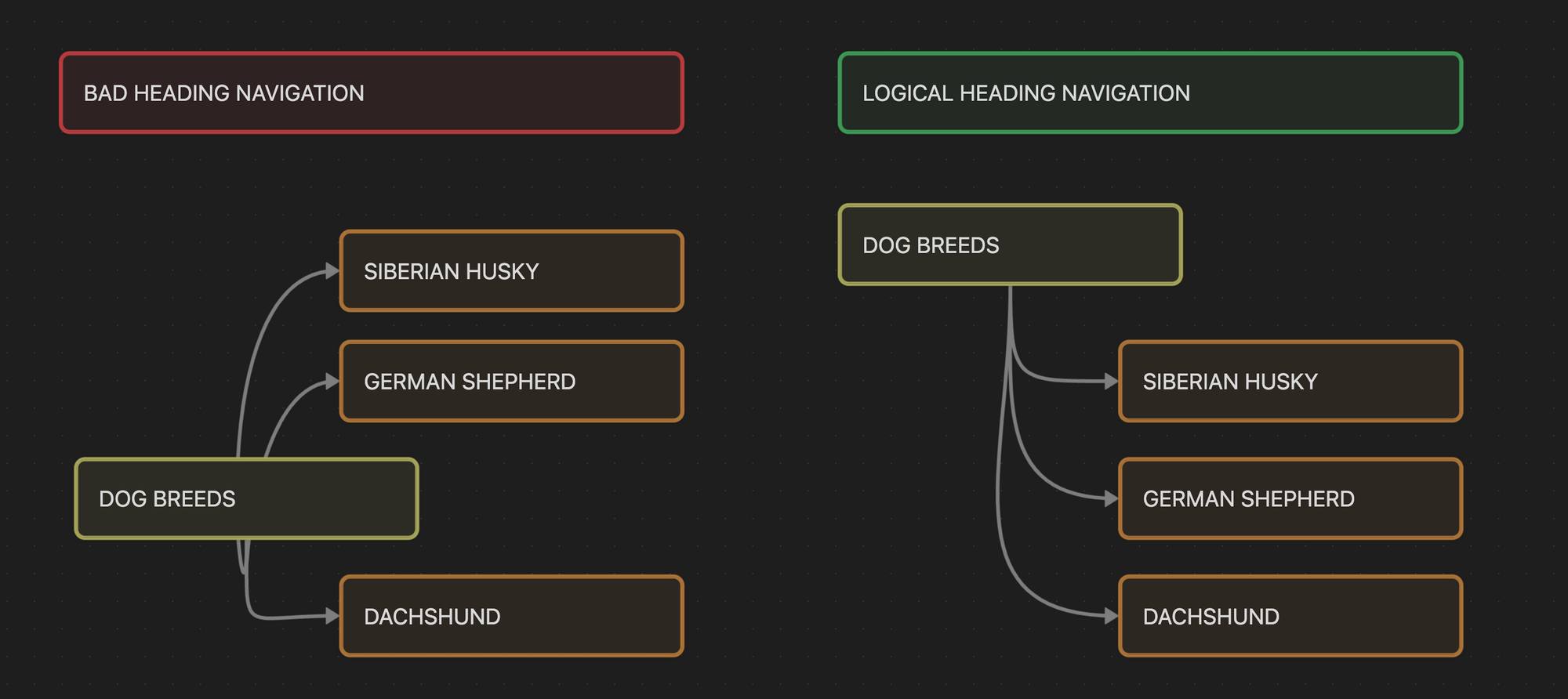
Why is it telling me that I need to access Siberian Husky and then Dog Breeds? The section is supposed to be about dog breeds in general and then allow me to get specific.
When you put your heading levels out of order, you’re messing up the document flow—and you might even be grouping sections incorrectly.
For example:
Pets for an Apartment
Cat
Lorem ipsum
Guinea Pig
Lorem ipsum
Never
Pit Bull
Lorem ipsum
In the figure above, the designers wanted the "Never" to be a visual cue in combination with the <h2> for Pit Bull, since an apartment is not ideal for that type of dog. If the design has the "Never" styled exactly the same as your <h3>s, you'll be tempted to slap on the <h3> over the <h2>, breaking the logical ordering.
Fortunately for you, this is an easy one to fix, especially with some of the newer techniques and CSS options available.
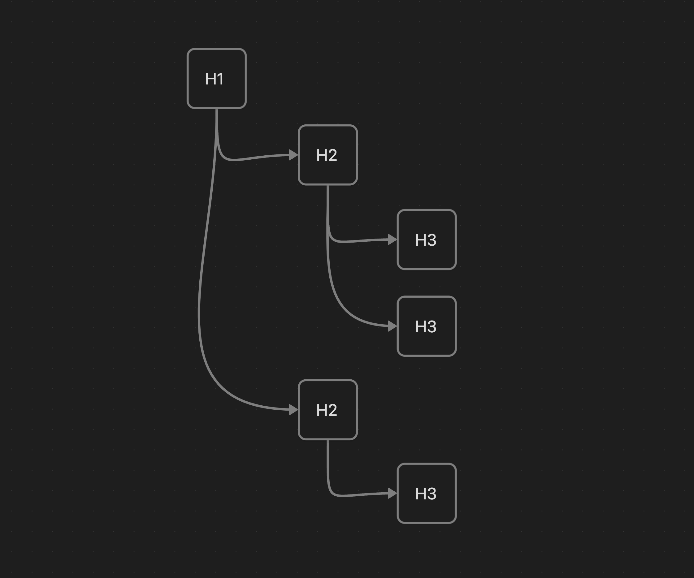
Rule #1: Logical Ordering
First, always choose the heading level based on its logical order and structure. If the headline fits under the current h2, use an h3, if it’s a new subject matter, use an h2.
The numbering should clue you in on which number should be next. If the most recent <h> tag has a 2 in it, and your next heading fits under the topic of that <h2>, then you should use an <h3>, regardless of the designer's choice of styles. Is there yet another heading under the h3 that is even more specific and addresses the same topic as the h3? Then use an <h4>. When you're ready to pop out of that specific topic, resume where the next logical heading level would be.
Rule #2: Use Classes or Variables for Styles, not Tags Themselves
Classes or CSS variables should be used to apply the styles, rather than applying them directly to the <h> tag itself. HTML is supposed to guide the structure of the page. CSS is how you control its look and feel.
Even if you do create base styles for each <h> tag for ease of use, you will likely encounter situations where the document dictates a need for different styles to be applied, but the heading levels need to still do their job of maintaining logical ordering.
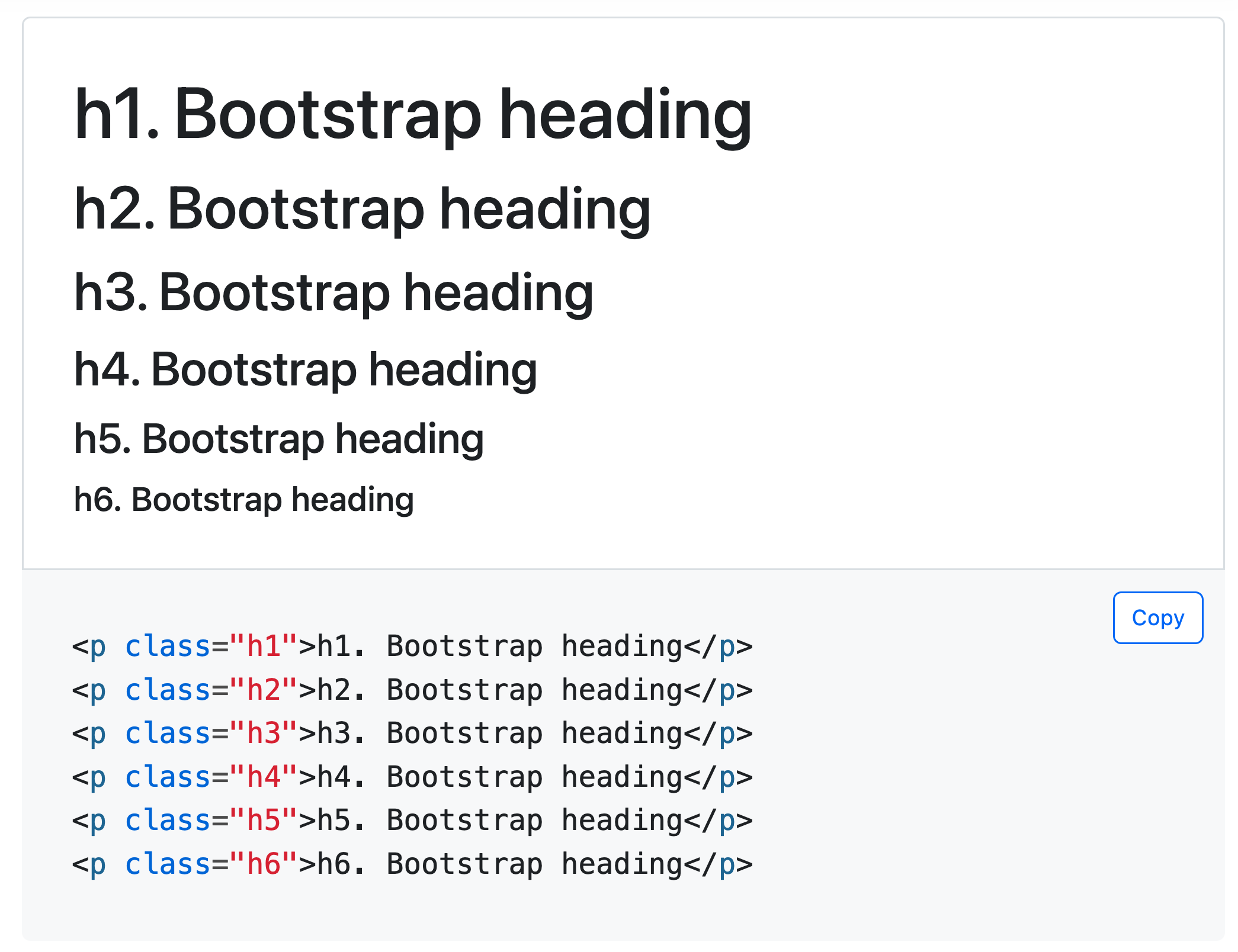
You can take inspiration from Twitter Bootstrap, for example, which defines heading level classes: .h1, .h2, etc. This way you can add the style you need to the text without adding heading levels out of order or skipping heading levels (like going from an h2 to an h5).
You can also use CSS variables to define the typography and then use those tokens on classes as needed.
This way you can apply the design you need without hurting accessibility (and in turn, SEO—see, I’m not leaving you out). Let's make the internet better for everyone.